Signing up as a partner is FREE. Explore our software, setup a test site and see for yourself!

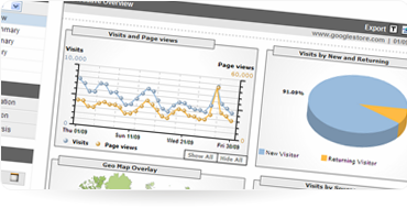
Add websites to your dashboard, select designs, adjust billing options, analyze metrics.
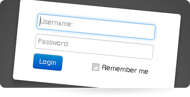
Add & manage all sites from one place. View income through your "Blank Balance" and project sales!
Open new revenue streams, offer support and bolt on customizations to meet your client’s every need all without exposing a 3rd party.
Growing is effortless when you can sign up and launch a new website in just a few clicks. With seamless billing you aren’t left with the accounting headaches.
The primary goal of Blank is, and always will be, to make your life as simple as possible. We’ve boiled down our tools to include everything you need to get the job done, without overwhelming you or your users.
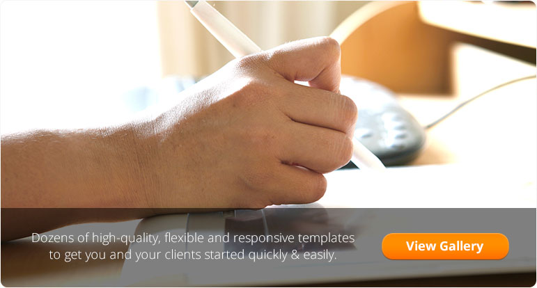
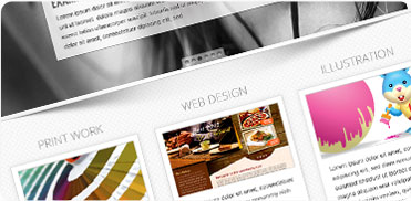
We provide modern themes to help you get started quickly, but you’re more than welcome to design your own and Blank can give you all the tools to make content editing easy!
Did you know the mobile market is scheduled to overtake desktop Internet usage by 2014? Responsive web design adapts to your screen size when you view the website. That means when you’re viewing from a mobile device the layout will be optimized for small mobile viewports and medium sized tablet displays. On a desktop monitor your site will display in full. All without creating and managing separate “mobile” sites or mobile content.
Creating your partner account is Free! Your websites are set up as needed and billed individually.


 Facebook
 Twitter
 G+
G+